
Challenge of finding datasets
By Lulu Graham
As a journalist I need data to verify information to ensure I report in an informed, unbiased manner.
Data is even more integral in data journalism where datasets are often used as entry points which spark story ideas and journalistic investigation.
However, I encountered a significant challenge in finding recent and clean datasets when writing a story on changes to Victorian anaphylaxis rates.
This challenge I experienced is common among data journalists, with the 2021 State of Data Journalism survey finding it to be the largest limiting factor in the production of more data journalism.
As I was unable to locate a dataset for my story, I became reliant on collating data from various government websites and reports to create my own spreadsheet.
Positively, this enriched my understanding of my topic as I was encouraged to gather data from a wide range of sources on varying interrelated issues.
In doing so I made a conscious effort to find definitions associated with each section of data I was collecting as often there were limiting words, or specific factors which were included or excluded.
In writing my story I included these definitions if I perceived them to inform the way readers would interpret, and make conclusions from, the information.
This is an important journalistic practice as it reduces the likelihood of data being misrepresented in reporting, aiding to reduce the problem of misinformation.
A PBS data journalism story on mass shootings uses this practice effectively by defining what counted as a single order, helping readers understand the data.
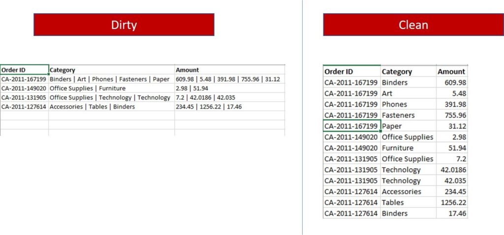
The story also openly acknowledged the presence of incomplete, or ‘dirty’, data.
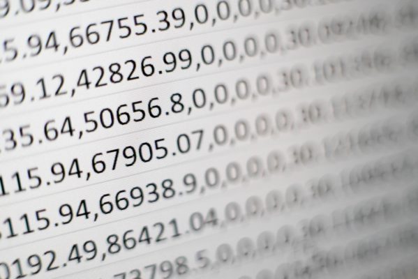
Using ‘dirty’ datasets, which are those containing missing values, errors, or do not strictly conform to the CSV or XLSX format, was an area I encountered in writing my story.
In some years the anaphylaxis rates for certain Victorian local government areas (LGAs) were missing.
As my story relied on me performing calculations and creating pivot tables on Excel, I became aware these missing values could skew my calculations, particularly that of the mean value.
To ensure my calculations were accurate and equitable across the three years, I discounted the LGAs with missing data from the total number of LGAs for that particular year.
This experience, alongside the use of ‘dirty’ data in the PBS story, taught me it is possible to produce a quality story with incomplete data if you are aware of potential limitations and the requirement to clean the data either manually or on Open Refine.
After all, the most insightful data journalism stories often come from numbers hidden under the surface.
Challenge of choosing a dataset
By Ruby Littler
Prior to taking this course, I did not understand the intricacies behind collating and curating data for stories. The numerous digital formats, like Excel and Open Refine, had me feeling like I lost my way to class and stumbled into software engineering.
Despite my initial apprehension and fear of maths, I came to realise the crucial role data plays in journalism. Data-driven stories ground the audience in facts which not only adds validity to a piece but increases the credibility of the journalist.
In a field fraught with misinformation and extremist news, the value of source-based content is increasing. As a burgeoning journalist, I want readers to trust the information I share, so mastering (or becoming somewhat competent) at these skills is important.
My first assessment explored why teachers are unpaid. While there isn’t a single answer, through finding specific datasets I was able to focus on an isolated reason; the ratio of women in education.
Some people in class shared how they struggled to find applicable data, but my challenge was quite the opposite. This was thanks to the recently conducted ABS 2021 Census, giving me plenty of current newsworthy statistics to draw from.
I found that the Australia Bureau of Statistics had a large repository of information regarding the workforce, wages, the ratio of male to female teachers, changes over time, teacher’s wages compared to other industries and the gender divide in managerial positions.
In the end, my biggest challenge was choosing which dataset best value-added my written story.
As a class we analysed and discussed the ABC’s visualisation of the 2021 Census. The faults we found in one particular article they did, entitled Census 2021 - Australia as 100 People, encapsulates the conundrum I faced.
This story was an information dump, without a driven plot or personalisation to the data. Its aesthetic functions and use of journalistic technologies was engaging however, the class concluded that readers would struggle to retain any information.
The scope I set myself was too big. I went thinking I would struggle to find anything, so I downloaded any data set that looked applicable to my story.
The more data I uncovered, the more there was to understand (hence why I’ve decided to continue exploring the issue for my second assessment).
It was frustrating knowing the information I needed was there, lying behind rows upon rows of data but feeling like I didn't have the technological skills to access it. Next time, I will go in with a more fixed idea rather than doom scrolling and needlessly data cleaning numerous Excel spreadsheets.
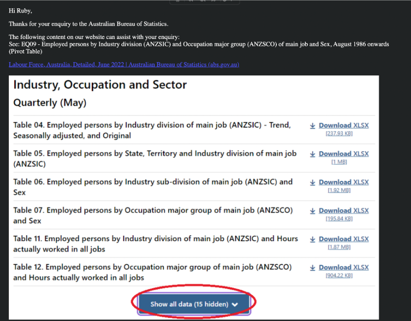
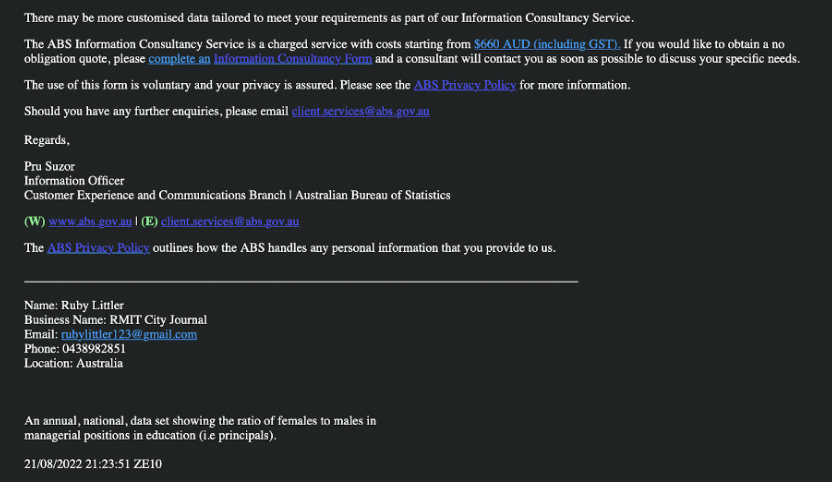
The statistics I wanted showed the ratio of males and females in managerial roles. I requested the exact set of data through an online application and thankfully ABS emailed me back with the relevant data set, pointing me in the exact direction I wanted.
Challenge of understanding data
By Jack Langdon
I know Tito said at the beginning of the class that even if you are not good at maths, put your best foot forward in this class.
Still, for someone that stopped maths at the end of year 10, the thought of going through thousands of rows of data on excel, it was a daunting road ahead.
Excel has always been one that was put in the ‘too hard’ basket, so when the first lecture was all about Excel, I did panic a little.
But after watching the first lecture and attending the first class, it became apparent that calmness was key to understanding data. If I look at all the data as one big set, obviously it would be overwhelming, the key, for me personally, was to break it all down.
I have learnt that while data can tell an overall story, you have to break it down into chapters to get into the end of the novel.
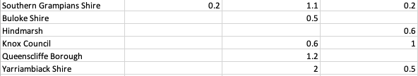
The key to being able to break it down I learnt is having clean data as opposed to dirty data.
Dirty data is messy and makes me very confused. As a person who can be lazy sometimes with putting things in the right place, I knew in order to overcome my challenge of understanding data was to make sure it was clean.
But to get the clean data as seen above, I felt like I had to tackle a beast in Excel.
Whenever I downloaded the data from a website and went straight into Excel it was quite scary at how big it was.
While watching Tito’s lecture on how to sort data, I was pausing it every couple of minutes because I was so confused. Slowly, but surely I would push ahead.
I still find it challenging to understand data, but clean data has made my life a lot easier.
Admittedly, after starting with a lot of dirty data, it is highly satisfying when you reach a conclusion.
Part of my reason for wanting to be able to understand data is the way modern technology is moving. Now with modern advancements I realised that we have access to so much data, so it is important to be able to understand it.
Data Dumps as explained here is something I always want to avoid as I know if the data is not simplified, I will simply ignore it. The human brain can only process a certain amount of information.
That is why, despite challenges I have seen it as important to understand CLEAN data.
Challenge of finding the story within the data
By Tess McCracken
Admittedly, looking at raw data was simply overwhelming at the beginning of the semester. How am I supposed to find a story in a sea of numbers that seems to be never-ending?
The sheer scale of some data sets invited my fear of numbers, a fear that hasn't surfaced since high school maths classes, largely because I have spent the last two years avoiding numbers and data any chance I could.
I have long told myself, ‘I’m just better with words,’ but finding the connection between numbers and words during this class has opened a world of new story ideas and angles I would never have considered previously.
Finding the story within the numbers was a new skill assignment one required me to develop. In the initial stages, I found myself looking for small and already ‘clean’ data sets, something I felt I could digest easily.
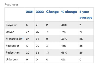
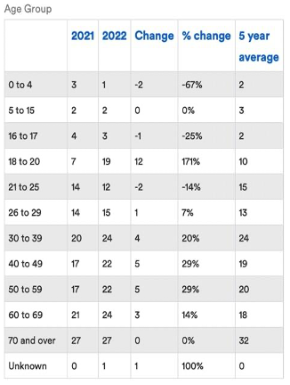
My story for assignment looked at Victoria’s road toll statistics. The Transport Accident Commission website favoured my inherent desire to stay away from big data sets with their already ‘clean’ data broken down into small tables, particularly the function that allowed me to select my variables of interest and a table would appear. See here.
Instead I had to use these tables as a base for my research, find the raw data and fight the urge to simply repeat the statistics in a hard news format and take the statistics at face value.
My first attempt at finding an angle was about as uncreative as it gets. “172 lives have been lost on Victoria’s roads this year as Victorians get back on the road after lockdown,” was what I had written in my word doc.
Realising that was an incredibly unengaging angle, I began searching for a different story idea within a different data set.
However, I eventually circled back to my initial data set, deciding to review it once more and found myself honing in on the specific variables that contributed to road traffic incidents in Victoria and the different categories within the data (age, gender, road user, level of urbanisation etc).
From there, I came to the realisation that simply looking at the data as a whole is not enough to write a compelling story, it is the reasoning, the people and the circumstances behind the individual numbers that make a story worth reading for the audience.
So far, this class has allowed me to overcome my fear of large data sets and has challenged me to look beyond the number and find one of many stories that hide within the numbers.
(Featured Image: Julie Benedict)
[…] inefficiencies, and more. In these areas, where the sheer volume of data can be overwhelming, data journalism provides a revealing […]